
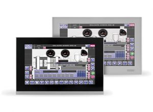
The goal of any effective HMI display is to facilitate the flow of information between the machine and the human operating it. Today, UX (or User Experience) design is not really considered to be a discipline in its own right within the industrial manufacturing industry, so the task of designing HMI displays can fall to system integrators or IT personnel. If you’ve been tasked with setting up an HMI display for your installation, we can offer you a few pointers to make sure your displays are clear, uncluttered, and useful for the machine operators.
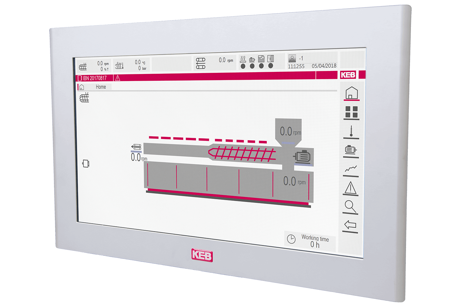
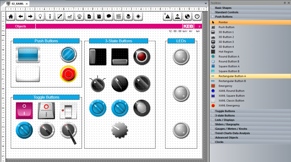
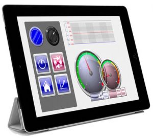
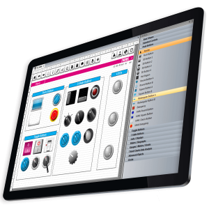
For creating functional HMI displays, KEB has developed COMBIVIS Studio HMI. You can download a free trial of the software here. Like many HMI design programs, COMBIVIS Studio HMI gives the user a wide range of options for building the display. It can be tempting to include visually interesting elements like 3D effects, animations, or gradient colors, but before you bring something in, you need to consider the number one goal of an effective HMI display – does this element help the operator communicate with the machine (or vice versa)?
“A good HMI design reduces cognitive load rather than adding to it,” writes Jon Walter in his article UX for the Industrial Environment (uxmatters.com, 8/7/17). He adds that anything that does not add value should not be on the screen. A photo-realistic, 3D rendering of a tank may look visually pleasing, but if an engineer is tasked with monitoring several screens at once, or a worker on the factory floor has to interact with the screen using bulky gloves it may be more useful to have simple gauges or meters. “Designers should be ruthless about removing extraneous design elements that neither provide useful information nor help the user understand that information,” adds Walter.
Once you’ve identified your most important metrics and decided on the best way to visualize those items you can plan the layout. Group together related elements so it’s easier for the viewer to perceive them as a single piece of information. For example, group all elements measuring temperature in one area of the screen and those relating to pressure in another area. Each grouping should be arranged by the hierarchy of order of importance or in a way that conveys dependencies, depending on the needs of your HMI. The display should be a reflection of the user’s mental model, not necessarily a physical model of the system they are monitoring.
You may want to use wireframes for this step in the design process, especially if you are using unfamiliar software. Wireframes will also help if the design process requires approval from stakeholders within the company, as the turnaround will be much faster.
So now you have a list of elements to include and the layout of your screen. It’s time to build the functional display. In most cases, you can choose an intuitive or expert design. These designs might not cover all the possible scenarios in which HMI is used, but they will give you a starting point for many.
In the case of HMI on the factory floor which is used by many people who are also tasked with other jobs, you will want an intuitive design. Familiar color schemes – green for GO or OK, red for STOP or ALERT, yellow for WARNING – might clash with corporate branding, but they are highly recognizable in an emergency. If navigation is necessary it should be limited and consistent. Whether it’s using breadcrumbs or a BACK button users should be able to return to the home screen in two or three clicks at most. For capacitive touch displays that are not able to provide tactile feedback to the user, you should include visual feedback responses to user interaction. In these types of screens, it’s also very important to be aware of any applicable regulations – military, ADA, ISO, or industry-specific rules related to the HMI’s function.
There are cases in which a design that seems intuitive to you might not be the best design for the situation. Some displays are made to be used by a single user, and that single user will be interacting with the HMI, or many HMIs, throughout their full shift. Where bold colors and high contrast will benefit the intuitive design, they might contribute to eyestrain in the expert user. Reduce the contrast, use grayscale or minimal colors, and keep everything on a neutral gray background.
For expert layouts, you may want to gather user stories from the people who will be using them. Find out what their expectations are regarding certain buttons, displays, and interaction events. Ask them why they clicked or tapped where they did, and what they expected to happen, and where they would first look to find important statuses. In contrast to the intuitive layout which should use standardized design elements, the expert layout should be designed in a way that is best for the specific end user.
The future workforce will be able to provide professionals that hold degrees in UX for engineering and industrial settings, but for now, most of these programs are overly broad in scope. Until that time, we can take information that we know to work in other scenarios – website and app design, for instance – and apply that knowledge to the factory floor. As a designer, be sure to communicate with your end users before and after the HMI screen has been placed in their hands so you can be prepared to make adjustments that help the flow of communication between man and machine.
If you’re interested in our COMBIVIS Studio HMI software, drop us a line using the Contact Us form. We’d love to help you design the perfect user interface.
Related Articles

Let's Work Together
Connect with us today to learn more about our industrial automation solutions—and how to commission them for your application.